Mobile app design
Mobile app design is decided in the first 3 seconds
Onboarding, the moment of first value, the App Store screenshot story — mobile app design starts with all of these.
Quick answer
Mobile app design from user flow to onboarding, design system, and App Store screenshots — end-to-end UI/UX service.
We build component-based design systems in Figma, test user flows on prototypes, and iterate alongside development. Result: consistent, fast-iterating, accessibility-strong design.
Our mobile design delivery standard
- Component kit and design system in Figma
- Flow testing via clickable prototype
- Dark mode and accessibility contrast
- App Store and Play Store screenshots
- Design handoff: spec doc for developers
100+
Projects shipped
10+
Years of experience
96
City coverage
4.9/5
Customer rating
Why mobile app design is its own discipline
Mobile app design isn't web design shrunk down. Touch-target size (44pt minimum), thumb-zone (the comfortable thumb-reach area), gestures, native component behaviors (iOS swipe-back, Android back button) are all mobile-specific. Designing without knowing them produces screens that look pretty but feel exhausting.
Our approach: before building a design system in Figma, we set up a 'foundation kit' referenced from iOS Human Interface Guidelines and Material Design 3. The brand identity rides on top, so the foundation is solid.
Onboarding and aha-moment design
Among the thousands of designed apps, the few that survive past day one do so because of onboarding quality. The 'aha moment' — the first time a user gets value from the product — must happen during onboarding, not after.
We design onboarding as 3–4 screens, fast to skim, skippable but capturing the necessary minimum information. We time 'intrusive' requests like push notification permission and location permission correctly; otherwise users reject them before even using the product.
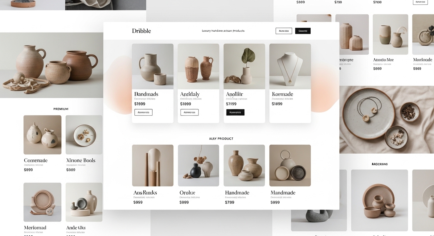
Design system and component kit
To avoid producing new colors, new typography, and new button variants every time a screen is added, we build a component kit in Figma. All button variants (primary, secondary, tertiary, destructive), inputs, cards, modals, and navigation components come from one source of truth.
This kit also lives on the development side — design tokens (colors, typography, spacing, motion) sit in a single theme file in the Flutter or React Native project. Future design tweaks ship in code in minutes.
App Store and Play Store screenshots
App Store and Play Store screenshots are mobile app design's continuation in the store. The product value is told in 5 seconds; weak copy raises user-acquisition cost.
We prepare the asset kit in Figma: device-frame mockups, strong headlines (typically 5–7 words), short copy explaining why each screen is shown. Separate kits per language; with our ASO team (when available) we A/B-test titles and descriptions.
Frequently asked questions
No. It covers flow (UX), micro-interactions, motion, dark mode, accessibility, and App Store screens. UI is just one piece.
1–2 weeks for a simple MVP; 3–4 weeks for a mid-size app. Iteration continues alongside development.
Yes. We review your Figma file, share a design audit covering needed touch-ups, then start development.
Mostly single-source design — especially in Flutter projects. We use platform-specific components when very native feel is required.
WCAG 2.1 AA contrast, dynamic type support, screen-reader (VoiceOver, TalkBack) labels, focus states. These ship in v1, not later.
Locations
Locations where we ship mobile design projects
We provide mobile app design service across global hubs. The locations below are where we deliver most often.
Selected projects

FitTrack Mobil Uygulama
Kişisel fitness takibi ve antrenman planlama uygulaması. iOS ve Android platformlarında 50.000+ aktif kullanıcı.
ShopZone E-Ticaret Platformu
Çok satıcılı e-ticaret platformu. Entegre ödeme sistemi, stok yönetimi ve analitik paneli.

Nova Kurumsal Web Sitesi
Enerji sektöründe faaliyet gösteren Nova şirketi için modern kurumsal web sitesi.
Related guides
Articles to read before deciding on mobile design
Guides on design principles, process, and budget.
Process
Mobile App Development Process 2026: Idea to Launch in 4 Phases
We split mobile app development into four clear phases — discovery, design, development, and launch — and detail each phase's deliverables, duration, and risks.
9 min
Cost Analysis
Mobile App Cost in 2026: What Actually Sets the Price?
$10K or $200K? Mobile app cost is set by 7 line items: scope, backend, integrations, native need, testing+security, maintenance, phased approach. Concrete ranges per item.
9 min
Decision Guide
iOS or Android First in 2026: Budget + Market + Strategy Decision
Which platform first? Market share + user value + budget + monetization + review speed + native need. 8-heading data-driven guide.
9 min
Start a mobile app design call
We do a 30-minute design audit on your existing design or new project and share commentary. Independent, non-binding.